Opening Friday, January 14, 2022, 7 to 10pm Exhibition continues through February 25
From 2015 to 2017, Hallwalls presented a series of eight regional group exhibitions under the over-arching rubric of Amid/In Western New York, a coy allusion to a multi-venue biennial from the previous decade called Beyond/In Western New York. Where Beyond/In was anchored by the Albright-Knox Art Gallery, helming a group of galleries, museums, and curators from Buffalo to Lewiston, Amid/In was decidedly low-fidelity. Three humble curators poking their noses into over 200 artists' studios and exhibiting the work of 78 artists across all media. Five years after that final group exhibition, we felt it was time to get the band together for a fresh gig of studio visits and snap judgments. As was the case in the original project, we obeyed no theme and pursued no specific logic outside of what we found interesting, an iconoclastic collection of weird gestures and curious choices.
John Massier: Usually working in book or web formats, it was exciting to prompt Ariel Aberg-Riger to concoct a version of her work for a gallery setting, within a group show no less. Her resolution to retell a regional ecological tale on a canvas scroll takes the original web-based story and transforms it into a kind of historical artifact, a freshly discovered manuscript whose casually hand-written story belies the dark, portentous tale within.
Kyle Butler: Much of Ariel Aberg-Riger's work is in digital storytelling, with narratives splayed out over a vertical scrolling format. The space available for the narrative is indefinite, and translating that narrative structure to a gallery meant having to negotiate finite space. Her answer to that, a hand-drawn narrative printed on canvas and hung like the cloth towel racks that haunt bar bathrooms, is endearingly physical.
Rebecca Wing: I was surprised that the visual stories woven by Ariel Aberg-Riger escaped my notice for so long, She's got an admirable back catalog of drawn characters and stories of historical significance which, accompanied by her hand-written voice cutting to the heart of the matter at hand, washes over you with the familiar pacing of a conversation with a good friend. We all seemed to gravitate towards Riger's piece themed on Lake Erie at once. I remember tracing her lake-as-paint down the page during our studio visit, following the water's splashing and pooling alongside her story.
JM: Becky Brown's works strike a jovial balance between tight, specific gestures and the possibility that some gestures and lines are barely held in her control. They can be sharp and pointed or loopy and goofballish. But the smartness of her aesthetic choices gleam through the cacophony when you realize how her riotous fields of color manage to hang together in some kind of considered balance, an unexpected result given the wacky freedom of the individual elements. It's always refreshing to see works that maybe shouldn't work, but do.
KB: Becky Brown's work often equates visual complexity with the complexity of the hyper-connected world of information. It doesn't act so much as a societal barometer as it does one for the psychological impression of that information: overwhelmed, fragmented, and with familiar phrases, images, and sites briefly coming up for air before diving back into the muck.
RW: There wasn't a single thing in Backy Brown's studio that I didn't want to hang in the gallery for the next 7 weeks for this show. John made a fair point that Amid/In 2022 was already shaping itself into a lovely cacophony and we narrowed our focus to a body of work that is an outlier because of its scarcity of text (not including My Passwords). The layers of image/line/pattern/color are so visually dense, often providing camouflage for the most recognizable elements in her small paintings–photographic figures and landmarks collaged into the frenetic environment of each surface, or the stack of objects–spiral-bound notebook and paper pads–seemingly dumped casually on a tabletop and inadvertently encapsulated in a sculpture–with new lives as part of a collective whole.
JM: Extra bonus points to Julia Dzwonkoski for landing upon a very apparent schtick—"I'll make drawings about ghosts!"—without the result becoming schticky. For the simplicity of her ghost form (a curvy line with two dashes), Dzwonkoski manages an encyclopedic range of scenarios, gags, and philosophical moments. While admirably humorous, they surpass their own cheek with great eloquence and frequently give us pause to think. And given the repetition of the core element of the ghost, Dzwonkoski manages an endlessly compelling deftness in her formal pictorial arrangements. The whole idea sounds like a one-liner but the actual works accrue together to plumb much more resonant depths.
KB: Julia Dzwonkoski doesn't seem to suffer the same fretting over which ideas to act on as many makers do. Her threshold for a compelling idea is permissive, and as a result her drawings illustrate all sorts of peculiar turns of thought. The main character of the ghost is persistent throughout, regardless of context, acting as an anchor to Dzwonkoski's traipsing notions.
RW: As universal and human characters, Julia Dzwonkoski described her pandemic project as one acutely aware and responsive to the artist's own gut feeling, placing a confidence in her viewers that somehow an idea—a phrase, a compositional decision that feels right—will also serve to hook and delight her viewers. Despite the brisk pace at which she continues to produce these paintings (often, a few throughout the course of a single day), the overwhelming variety of the ghosts' irregular activities and oblique remarks provide enough mystery to have prompted many personal contemplations, finding myself recalled from a reverie after following a suggestion along an entirely novel train of thought or unexpectedly ruminating on one of life's fundamental questions. I joked with a group of students while sharing images of this series, "I like to ask myself, ‘What ghost am I?'" It's no surprise that they'd enjoyed asking themselves that question just as much.
JM: Unsurprisingly, given that she has written a text book on color theory, Becky Koenig knows the power of colors when amplified through specific drawn gestures, no matter how simple. Or, better still, she is aware of the power simple forms and lines provide to certain treatments of color. And there are some wide poles in her work, from rigorous geometric forms to entirely ambiguous entities. Each play with space and mark making in dynamic and energetic ways.
KB: With each next piece, Becky Koenig seems to commit herself to a small idea built from the fundamentals of color and drawing. It could be a relationship between mark and shape, a relationship between textures, or between image and render technique. It's akin to reductive, formalist art, but with enough of a drawing voice and image reference to never quite land at something so austere.
RW: Apparitions seem to haunt the walls of this show—the oversized presence of a digital detritus in the form of Becky Brow's forgotten, revived, and accumulated passwords; Becky Koenig's selection of a single-use shape that drifts or looms multiples within the edges of one of her abstractions; Avalene Musik's figures of techno-cryptkeepers in a glitchy checkerboard pattern that reappear in several of her paintings; Karle Norman's life-sized silhouettes in cut-and-dyed leather, embedded in (and with) an autobiographical chronology that shares some the visual qualities and the weighty presence of ritual funerary objects; Julia Dzwonkosk's literal ghosts; Tony Nash's slow rendering of the repetition of a daily commute where banal frustrations and encounters of the day-to-day provide the only flashes of clarity sharp enough to recall one's attention to the here-and-now; and the shaky Nestor Zarragoitia portraits that have that same feeling you get from looking at old family photos of people you never knew.
JM: I can recall when we visited Avalene Musik's studio and perused works made by someone who only started painting in earnest during the pandemic and how enraptured we were. There were so many works where we discussed specific, painterly gestures and choices that appealed to us. And the wild spectrum of styles—from still lifes to graphic b&w works to works that were ominous and mysterious. Her freedom toward subject matter and unpretentious approach is the attitude many a schooled artist has tried to return to once they've been over-taught art school stylings.
KB: Avalene Musik is nurturing a unique ingenuity with painting, where her solutions for how to render an image often surprise or amuse. Though relatively new to painting, she has quickly developed a visual language that remains intact despite the frequent shifts in subject matter. Those shifts suggest an earnest aspect to her work, where there's the same investment portraying an unassuming still life as there is mulling over heavier issues of identity.
JM: It was a little crazy, how many Tony Nash paintings we selected. They are small, but I can recall how challenging it was for us to restrain our enthusiasm. It was a reflection of how many wondrous moments there are throughout his seemingly banal dash-cam oil paintings. The subject matter is truly ordinary but there's loads of painterly magic taking place, almost hypnotically so. Colors, forms, his treatment of light and weather conditions. There are tight renderings and more elusive ones. There is the traffic of the commute and the vacancy of an empty toll booth, evoking a peculiar and unexpected range of emotions. Ordinary life rises to the surface as some kind of ethereal experience.
KB: Tony Nash's series of commute paintings make the most of a banal situation. He's translated an unremarkable, necessary aspect of work life into a deep resource for images. The series leans toward being systematic, as if he's constructed a second job from the byproducts of his day job, but this is undercut by the exploratory way in which he settles on compositions by freely scrubbing through archived video until a reasonable image is discovered.
RW: I like the wonkiness geography and rendered space in this show, The grid of Tony Nash's oil paintings—culled from years of video footage from his daily commute—restrict any impulse or desire to relish in our admiration of a friendly stretch on a familiar road, or to gain a better vantage for our closer inspection of some subtle regional landmark. The vista is viewed uniformly from the driver's seat, once removed from lived-experience, contained within the frames of the windshield, Nash's video camera viewfinder, the still image selected as reference photo imported to a different digital device, the edges of the painting, the boundaries of the gallery wall.
JM: Karle Norman's figurative leather works really grabbed us in a weird way during our studio visit. I think we collectively appreciated the strangeness of his choice of format, retelling his own history across leather sarcophagi in a manner dominated by personal visual codes not entirely decipherable upon immediate inspection. Or even longer inspection—specific meanings remain veiled. Like long-lost hieroglyphics, his alluring works transform personal experience into symbolic narratives filled with mystery and transformation.
KB: We lucked out. In amassing artists and work for this exhibition, we happened to catch Karle Norman as he was just working out the specifics of a fresh, but long-brewing idea. The figurative leather works in the exhibition are uniquely iconographic, building a simplified and oblique language from the image distillations of his previous work and from his own history with family, spirituality, and change. Along these lines, I appreciate how the landscapes also included in the exhibition give a clue as to the origins of the sensibility in the leather works.
RW: Both Karle Norman and Becky Brown are dealing with real geographies—locations that actually exist in the physical world—but Norman's landscapes from an aerial view are based on photographs taken by the friend-of-a-friend on a journey Karle wasn't present, While Becky Brown's map has been constructed with different priorities in mind than its effectiveness in orienting a user in their actual physical surroundings. Brown invites our dreamlike uncertainty, obfuscating a too-recognizable map-form by scattering her topography with locations selected for the sheer poetic happenstance in the name of a place
JM: Craig Sheperd's astute transformations of familiar Rust Belt imagery into sharp, brightly hued scenes evoke the clarity of signage while also breaking down representational forms into somewhat abstract configurations. It's fascinating that he cites "neglect" as one of his sources of inspiration, though his aesthetic treatment transforms these sites of neglect into enchanted spaces where every object and form is lovingly rendered with great control and specificity. He applies great care in rendering neglect.
KB: Craig Sheperd's subject matter of aging infrastructure, colloquial street scenes, and the paraphernalia of the built environment could, in other hands, have the effect of a sort of fetishized voyeurism to weathering. But they are made with such care and precision that there is instead a respect communicated, as if that work ethic is a nod to the fellow toilers of daily life. Craig's aesthetic also seems informed by the pragmatic aspects of the imagery he portrays, where his paintings have a clarity of image in the same way that a road sign has a clarity of message.
JM: Though miniature in scale, Heather Swenson's sculptural scenes—withscaffolding, signage, and rocks—nonetheless impart their own kind of epic quality. The epicness of a charm bomb. There is a knowing quality to her reconfiguration of familiar, quotidian arrays in tiny, fragile arrangements. She realizes the allure of our world when remodeled as tiny considerations. It speaks a little to our own Lilliputian pomposity in relation to our world and tempts us to lean in if we want to get in on the action of the piece.
KB: One of the enduring themes of Heather Swenson's work is informal structures. She at times riffs on ancillary built forms like temporary signage or DIY all-weather structures. In another series (not included in this exhibition), she catalogs the many iterations of security patterns in envelopes, tracking a structure that typically goes unnoticed. Behind this is a sensibility, perhaps informed by her practice of collage-as-sketching, where shapes are skewed, textures isolated, and the composition is defined by a combinatory playfulness.
JM: The works by XIII are wildly diverse in realization but all share an iconography of a kind of mysticism, a spirit world infused by touches of digital representation and qualities of futurism. Maury Povich as a stand-in for a generalized white devil is particularly potent, with his dead white eyes and angular horns, painted as though they were exaggerated in Photoshop. Meanwhile, her hazy portrait of a black figure in an ambiguous orange shirt is simply rendered with its details smudged away but evoking a particularly strong evocation of identity and personhood.
KB: If XIII weren't so capable at shifting styles, you could say they were dabbling. In this exhibition alone are five paintings that each could become a body of work, but may instead be followed by five entirely different paintings. What I gather from this is that XIII is comfortable reacting to the world as themselves, employing their abilities when the interest strikes them. There are constants despite the differences among the works, like a persistently glamorous color palette and a manner of expression informed by digital media.
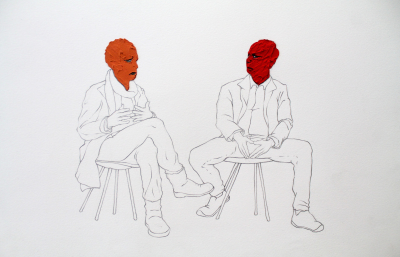
JM: I'm not certain we would call the paintings of Nestor Zarragoitia surrealist, but there is a decided weirdness to his sense of representation and portraiture. It's a world of misfit characters painted with a purposefully convoluted, but confident, style. There are so many spaces within his paintings that are wonderful to consider—odd renderings, satisfying color choices, and, most apparently, the off-kilter nature of his portraiture. It's as though he is conceding that we are basically a world of weirdos and it might be most appropriate to give subtle—and sometimes aggressive—emphasis to that weirdness.
KB: Nestor Zarragoitia's paintings illustrate specific scenes, though not always intelligible ones. You may not know who is being depicted, what narrative is playing out, but there's the sense that you are being made privy to a moment. In one, a man swings a chicken around, presumably for reasons. In another, Francis Bacon is restrained to a chair at what looks like a casual back yard gathering. Add to this Nestor's oddball shifts in stylization, what results are images that are as familiar as they are uncomfortable.
JM: In the end, as curators, we concede to our own weird inclinations and attractions in the artwork we selected. It's what we loved at this moment in time. As we begin to install it in the gallery, unsurprisingly, those seemingly-intuitive decisions reveal some kind of internal logic and all these crazy, disparate works start to look like they belong together. Natually, we collected them together under a shared title, so they "belong together" in that sense. But in other ways as well, in comfortable ways, where different things made by different people reveal their shared dreams, their shared color schemes, their eloquently-rendered lines, shared thematic origins, and the expressive threads of emotion that run through all we make and see.


 Amid/In 2022 - 2022